The Blog Subscribe
Your Photography…FINISH THE JOB!
I've had a lot of requests to talk more about images, techniques and my workflows, so I thought I'd start with something which is applicable to every photographer from iPhone user to Hasselblad user...'Finishing' the Image.
I get really frustrated with the latter day 'Professional Photographer'. Thats not to say that I feel threatened or insecure or that I begrudge them the shekel that they gain from using the term alongside their name.
No. What I cannot stand is the lack of attention to detail and their inability to finish the job properly!
"So thats because you're perfect Ewen?"
Aww hell no...for sure. I miss loads in my images and an editing session for me can turn into a painful experience just trying to spot something I've missed. That said, the one thing that was drummed into me over and over again when I started out was exposure and finishing for publication. This is without doubt the one factor that separates Professionals from 'Professionals'
I don't care how good you are at framing an image or seizing the moment with 'the camera that you have' (That's such a shite phrase. I hate it), your inability to finish the image properly in post is what turns your 'Great Shots' into 'Mediocre Shots' and 'Classics' into 'Also Rans'. And don't throw the "That's a Photoshop Manipulation and I simply couldn't live with myself" Bull into the mix. Photos have been cropped and adjusted for levels either generally or in areas, since Photography began before we even get started on masking, layering and multiple exposures.
I see lots of people who are 'Professionals' posting on social media and claiming 'the picture tells a story' and its 'Street Photography' and it really is not. Its a lack of respect for the art and an inability to complete the job you started. No end of images are sent in to obscurity for the simple reason that people didn't Finish The Job! I'm not talking something that's just an iPhone snap on their Instagram account...this is people taking real pictures with real cameras and getting it horribly wrong
I'm going to try and explain what I mean using some images that I have gathered from the net. All these images listed were returned in a Creative Commons search on Google & Flickr. Some are shot by people who fully admit to being Amateurs and others by people who are fully admitting to being 'Professionals', which is even scarier.
LEVELS
98% of the images I take have nothing more done to them, than cropping and adjustment of levels before sharpening. All of the images you are about to see here have only been corrected for Levels. There are no saturation changes whatsoever.
Underexposing an image in many circumstances is not a failure, its a huge positive. If you go out with the kids to play in the snow, always under-expose by 2 or 3 stops and then correct that exposure in post. I did this with film and I still do it now. If you're shooting on 'Auto' because anything else is just a bit too scary, then in all probability, in snow, the camera will naturally under-expose due to 'all the white'. If it doesn't then the chances are that you will 'burn out' the resulting image and that won't look natural or recover in post production. I would shoot in Manual and deliberately underexpose to the image displayed on the camera back by 2 stops.
So, what are correct levels?
Every image has a 'tonal range'. That is to say that it has a Contrast of White to Black and a Colour Range (there is a selection tool for this in Photoshop). In practical terms, that means that your image when processed should have Whites and Blacks within it and Reds, Greens & Blues (and the 16 Bagillion mixtures thereafter).
But 'Correct Levels', when I use the term, is referring to these in their true tonal 'values' Whites are actually White (R=255 G=255 B=255), Blacks are Black (R=0 G=0 B=0) and also that Reds are Red (R=255 G=0 B=0), Greens are Green (R=0 G=255 B=0) and Blues are yes...Blue (R=0 G=0 B=255).
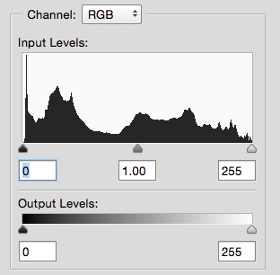
In the 'Levels' Histogram shown here, you can see that the 'mountain range' meets the ends of the 0-255 range. This image is 'well exposed' or has 'Correct Levels' (for black and white), although the trough in the centre shows that there are some Midtone issues that will likely need resolving.
"But Ewen, that would make for a very boring image if you just thought levels should be correct and there was no 'Art' ". No, obviously there are variations of all of these within the image but a well exposed image with no 'colour cast' will have some elements of that image that have these 'True' Values.
Also you need to be aware that an over-exposed white will always look more unnatural than an under-exposed black. This means perhaps favouring a slight underexposure, but when taking the image always try and make sure that light sources are under control with the rest of the image. Strong light sources or direct reflections that are 'in shot' give any photographer a headache regardless of experience.
One common mistake is that the general desire of the amateur is to 'lift' the exposure on the image by raising the value of the exposure sliders overall. Sometimes this means that the image can take on a 'grey' cast as heavy whites burn out and blacks are brought to far away from pure black. Sometimes images are more 'lifted' by darkening the shadows to make whites appear more exposed when actually the perception of the viewer is only changed by moving the contrast points.
Remember also to trust your eye but only as long as you have a calibrated monitor in front of you. With £100 burning a hole in your pocket, the choice of a monitor calibration system should be an obvious one. (Color Munki Smile £67 at Wex works on Windows & Yosemite just fine).
The other phrase that really bugs me is 'The Shadows have no detail". This really is mindless phrase and one which easily pulls photographers into 'grey' images. I recently helped a chap with an image of a boat on a sunset sea. The image lacked vibrance and the colours of the sea were weak and lacked orange tones. In correcting that, the ship, which was in silhouette anyway, lost a lot of detail. When I showed the gentleman the difference, he immediately agreed that vibrance of the colours was by far the more desirable element. The eye loses a lot of detail in shadows, why is the camera supposed to do better? Its one of the reason I have a deep hatred of over use of HDR. The average viewer will go 'Wow' at first but the immediate appeal will wear off once you notice the lack of vibrance in the depth of the colours and compound even further in any attempt at an output to print.
EXAMPLES
Take this first image, 'A. Holt & Sons'. Its a nice concept and pretty well executed on site. The building is obviously on a slight slope and the photographer has corrected the horizontal lines and is very close with the verticals of the door. The action to 'finish' the image is simple...make the white letters white. Having done that you can see that the pavement now has much more texture and colour and even the Grey exterior has taken on a new life. "But you burned out the window sills Ewen". Yes I did, I'd wager that given there was a good deal of sun falling on top of them (note the shadows under the letters) that the photographer also didn't see great detail in them with the naked eye. The image improves overall by letting them go just a little.

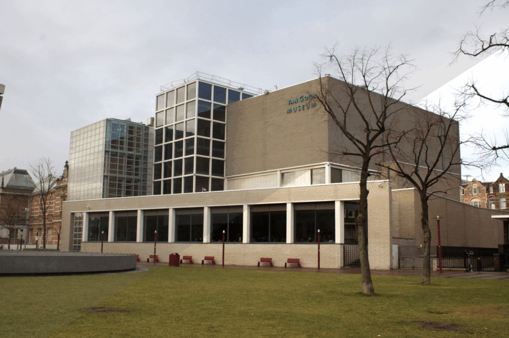
The next image is a tough one. The Van Gogh Museum has been shot on an overcast day and just after some rain it seems. Light cloud cover is great, its The World's own 'softbox' but once that gets thicker and greyer, so does your image. The key to finishing this image is once again make the whites white. The detail on the building was improved with increasing the levels of the whites but also decreasing the levels of the shadows allowed more colour to return to the grass, building and sky. In returning the colours to the image, some yellows have crept into the detail of the building's cladding giving a much warmer and less dreary feel to the image.
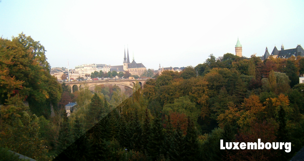
This image of Luxembourg is an image which is typical of nearly all holiday snaps and perhaps one of the easiest to repair. Again, the first thought is to raise exposure levels but actually just a simple increase of contrast by darkening the shadows has a massive effect on the image. The buildings in the distance and the sky are clearly bright enough. What was lacking was depth.
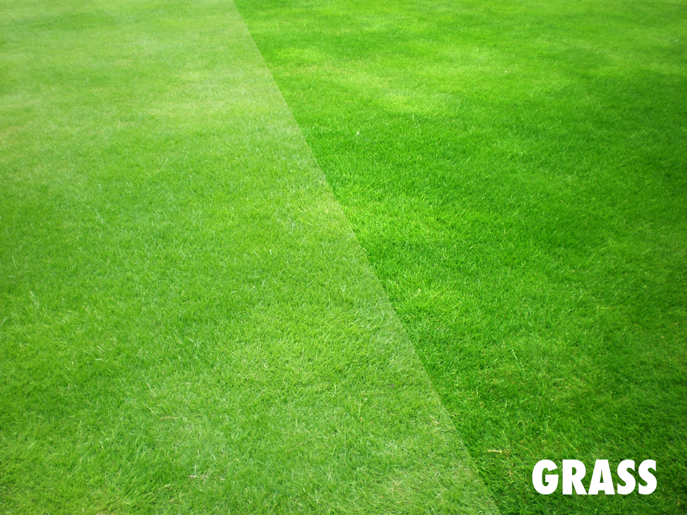
Another great example of this is the image of Grass. Just with some deepening of the tones through moving the dark slider on the left of the histogram, the lawn springs into life and all those lovely deep greens just dazzle. Ordinary to Extraordinary in 3 seconds.
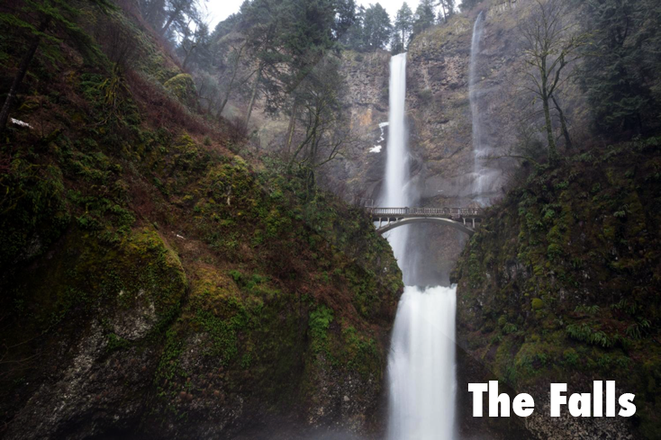
Same again the with the image of the Falls. The image is almost there and its a picky moron who wants to do more to it but just a little more depth and the image is perfect with significantly more depth in the greens and some yellows staring to show through as well.
LIGHTEN
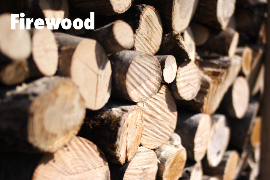
This image of the Firewood is another simple fix but this time it is purely an exercise in lifting the highlights and improving the contrast of the image overall. With a simple slide of the white and black controls in the levels interface, the wood textures spring to life and the image is just simply better.
"Ahh but you've lost some detail in the shadows Ewen". Yes I have but it was so worth it to release the oranges and browns in the cut wood ends and the shadows that give them so much texture.
The Bubble is a great example of an 'auto exposure' gone wrong. The auto exposure on the camera has probably gone for the 'jewel' at the underside of the bubble and this has meant that the camera has massively underexposed the image. If you were to throw in a higher ISO than was used, this image would have corrected but with horrible abberations and artefacts. As it is, the noise isn't too bad but the total image still doesn't recover brilliantly.
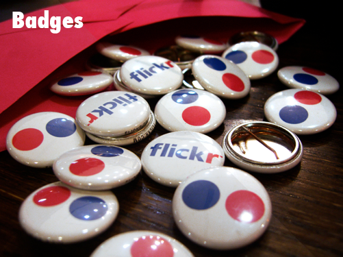
And Finally, The Flickr Badges. Again the highlights have fooled the camera here. The tendency is also to follow the histogram which would place the 'white' slider at the end of the mountain range due to the highlights on the badges but in actuality that makes all the other whites into grey and detracts massively from the textures of the wood in the desk, washing them out. A simple 'over-exposure' on the whites means that whilst I blow out the highlights on the badge, the whole image takes on a better look with more colour and vibrance, the woods can then be brought back with some contrast and the image is significantly improved.
THE PROFESSIONALS
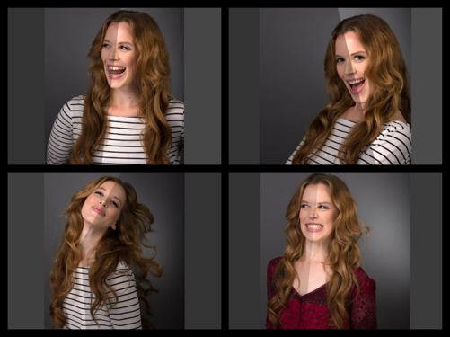
I've saved the best for last. These are images that are taken in studios by 'professionals'. I'm sorry but whoever you are, you've not finished the job. Whilst the images of the woman shows she is full of life in her face, the whole set of images is sprayed in a grey mist that is more bland than any politician I've ever seen and just kills any benefit. With a simple levels change to boost the highlights, the image transforms the woman into something entirely different and her vibrance and beauty shows through. Come On! I mean...she's wearing a classic Breton Shirt which is blue and white (Not gold and black) and which has no tones showing which are close to the true tonal value of white of R=255 G=255 B+255!
The Chap shown here clearly paid for and got a lovely bland corporate image, so its a shame that the levels weren't corrected to at least ensure that he had some tones and depth to his skin and look less like he has been dead for a week.
SHARPENING
Lastly, I want to talk about sharpening and the huge lack of respect that is shown for something which is essential to the completion of your image and is TOTALLY based on the output of the image that you are posting. I haven't sharpened any of the images above and indeed, I'm pretty sure that none of them have been sharpened before being posted on the websites I got them from.
"Whats Sharpening Ewen?"
Sharpening is a 'publication' tool for your image. I would never sharpen an image and then store it on a Hard Drive. I store the images, corrected for levels and colour and then the final activity before 'publication' is to sharpen it. The purpose of sharpening is to increase detail in your image either over the total image or selectively in areas where detail is lost.
Digital Cameras naturally 'blur' an image in the process of taking it. That can be brought back by 'In Camera' sharpening settings (often a bad thing to have switched on) or brought back in post production (good and more controllable). Sharpening should be applied by the person who is controlling the output to publication. And in the case of a printer...a decent one should take all of your images unsharpened and then sharpen them according to the print media and printer that they are intending to use...but this is a lost art and as a result the outputs for colour and sharpness are now hit and miss. There are no decent printers left anymore.
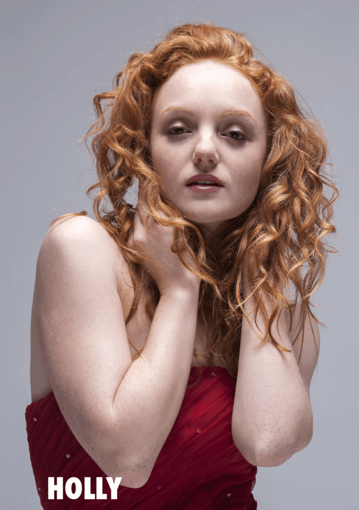
Say hello to Holly. I shot this image several years ago as part of a shoot for a Bridal Shop.
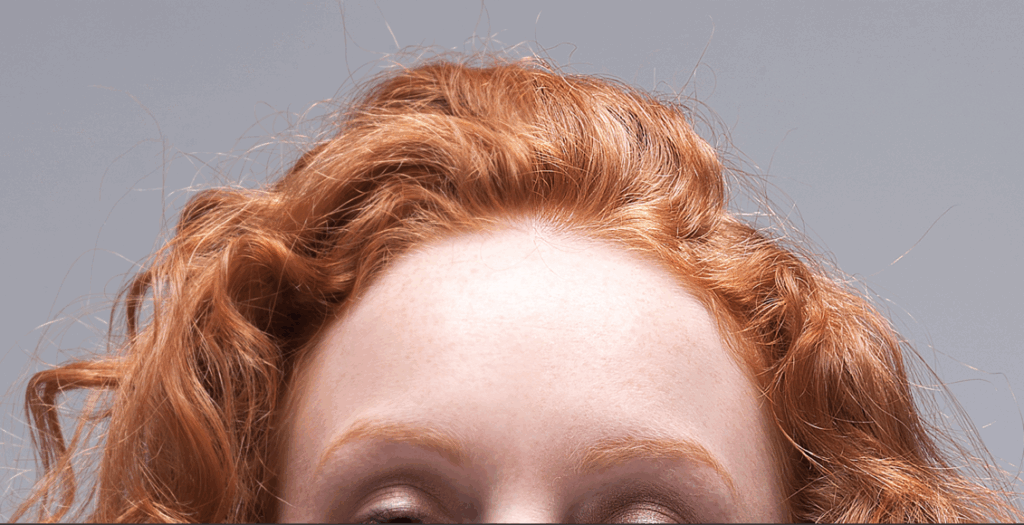
If you look closely you will see that Holly is in two halves. The left side of the image is unsharpened and the right side is sharpened. Even at this small size you can see that the hair to the right half of the image seems to 'catch the light' just a little more. This is because sharpening exaggerates the brightness in the image and thus gives a more defined edge between areas with low detail and highlights or areas of greater detail (which tend to have more highlights).
If we look more closely, you can see just how its working to improve the image on the webpage.
The key thing to recognise here, is that the process of sharpening is a contrived one. It 'exaggerates', thus it is important to keep it under control which is why I would never let the camera do this activity. Another good rule of thumb is 'never sharpen an already sharpened image'. It generally just looks worse but also you can end up with a 'herringbone' effect on areas of very high detail like hair and plaids etc.
"Can I over sharpen an Image Ewen?"
Oh Yes and its very easy to lose sight of when to stop. Size and Output Media are your guiding factors for sharpening. If this image was going on a billboard, I wouldn't expect sharpening to be strong or perhaps even not applied at all but as this image is going to be fairly small and on a webpage with a limited number of pixels, then the sharpening can (and should) be more aggressive.
If you're going to publish your image, then you must sharpen it.
SERIOUSLY?
Are you serious or not?
"Oh but not all of us can afford Photoshop Ewen".
Sorry but since Creative Cloud was reduced in price, PS is less than a packet of cigarettes and in many UK pubs, the amount for one months spend on PS wouldn't buy you two pints of beer. Its not expensive. Furthermore Lightroom and Photos will do basic levels changes and sharpening (I think?) and they are a lot cheaper.
Do yourself a favour and get a professional editing package if you are serious about your photography. Make sure the you use the calibration utilities in your monitor & OS controls, or buy yourself a simple and cheap calibrator as I've mentioned. The difference to your photography will be mind blowing.
Also, cut your images in half on a regular basis as I have done here. Adjust the image to how you think it looks 'finished' and then make a copy of half of the image and correct it based on the histogram and see the difference. Likewise do this comparison with your eye versus your histogram and you will learn to use the histogram as only a guide. In 90% of cases, the image will improve significantly. Don't be afraid.
And enjoy making a 'Good' image 'Great'!
Ewen
If you have a question or workflow that you want explained, drop me an email to BritishTechNetwork@gmail.com
Author

Ewen Rankin
